Designing:
Identity and Branding:
UCLA Architecture and Urban Design

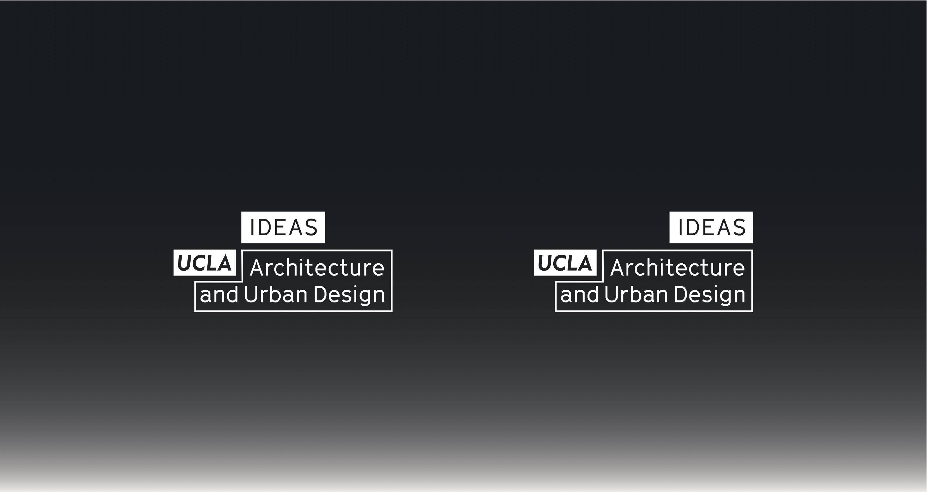
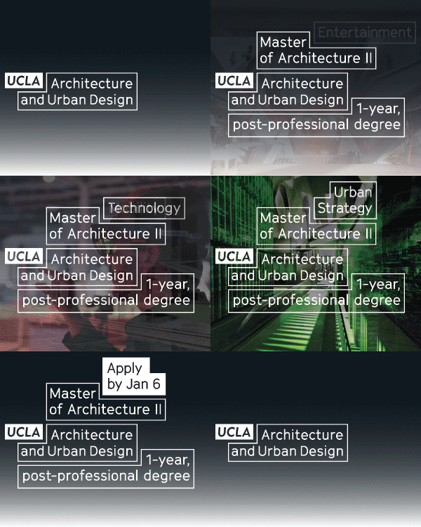
I worked with UCLA Architecture and Urban Design over several years to develop a brand system and work out its first implementations, both physical and digital. The parameters were challenging. There were a number of labs and extensions that needed to be folded into a system, and yet differentiated from one another, the most important of which was IDEAS, their second campus in downtown LA. Second, UCLA’s own brand guidelines at the time would not allow “UCLA” to be written in any form other than their own specific slanted sans-serif. It had to be incorporated as-is, and yet AUD wanted a way to differentiate from the rest of the campus. Finally, their end-of-year exhibition was itself branded as RUMBLE, and had to differentiate itself from the rest of the materials, as well as itself.
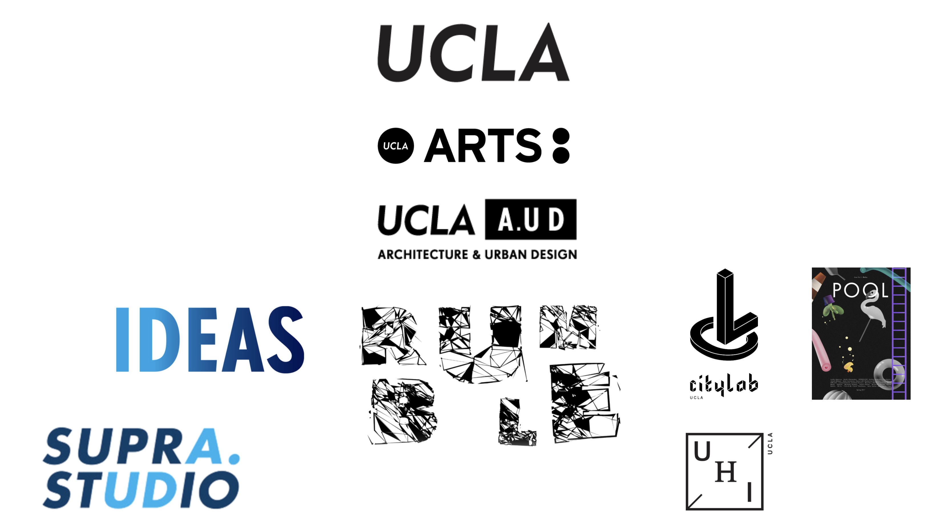 Pre-2018 logo, surrounded by parent and children logos
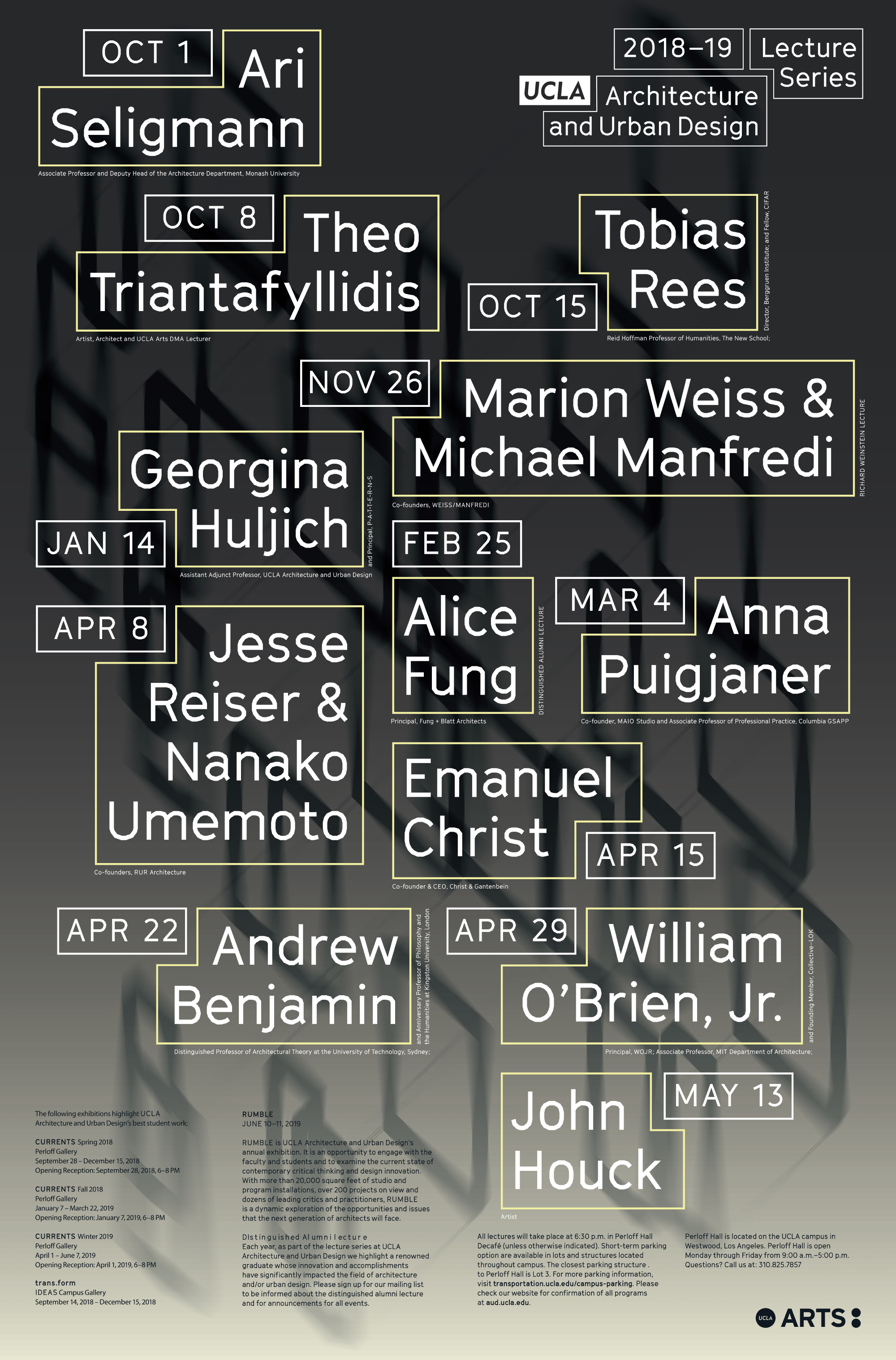
 The work began with an audit of all of the materials produced since the 1990s, as well as an audit of all of the contemporary expressions of various architecture schools around the country. The solution we arrived at was to use a set of 2 interlocking boxes for the logo, and more boxes for other expressions.

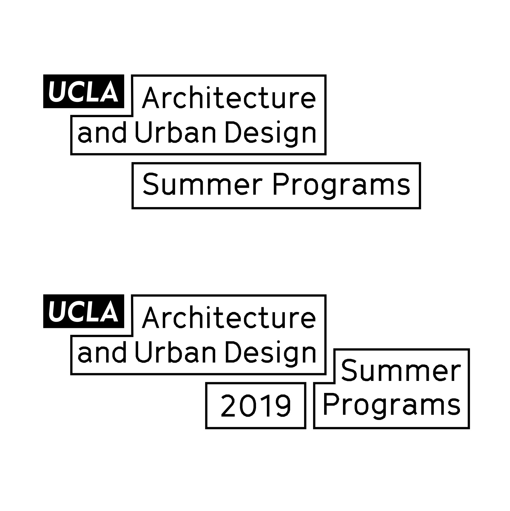
An abbreviated logo was developed for use in small expressions, such as social media avatars, where a word like “architecture” couldn’t be crammed into a thumbnail-sized space.


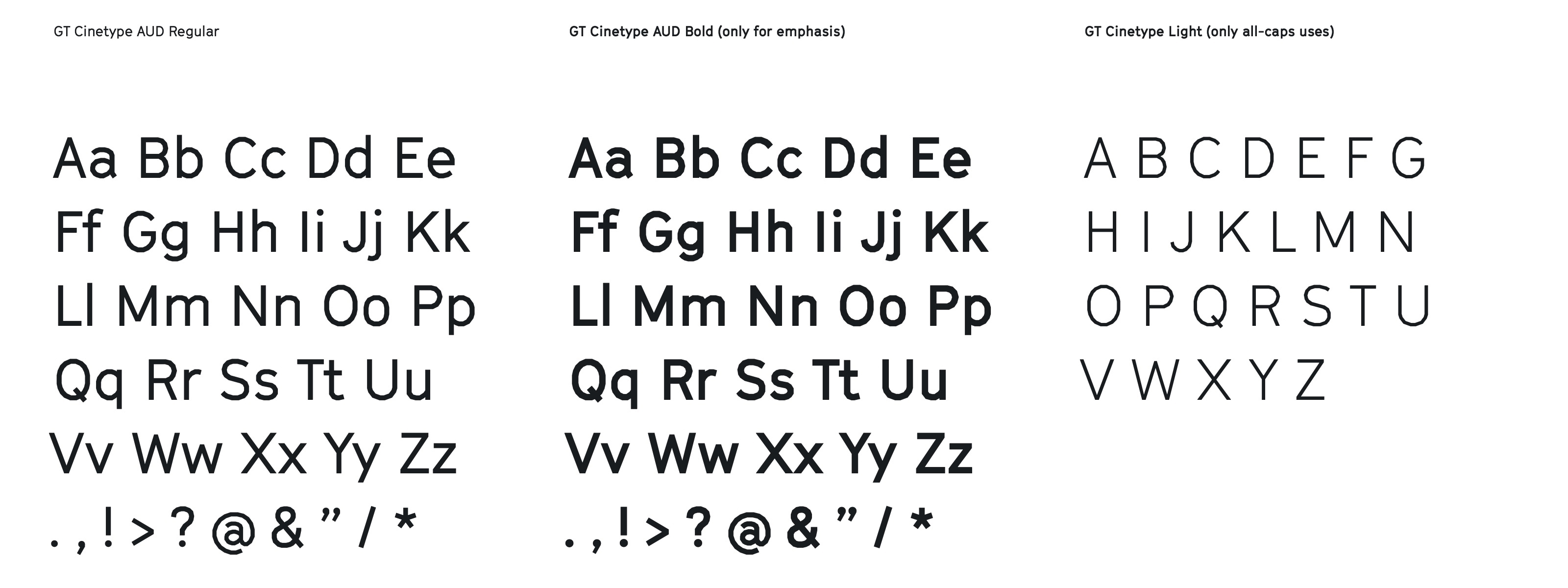
GT Cinetype was specified and modified (with permission), replacing its square dots with a faceted 7-sided form from the UCLA style guide. For all anchor materials, a set of colors and gradients were specified as well.
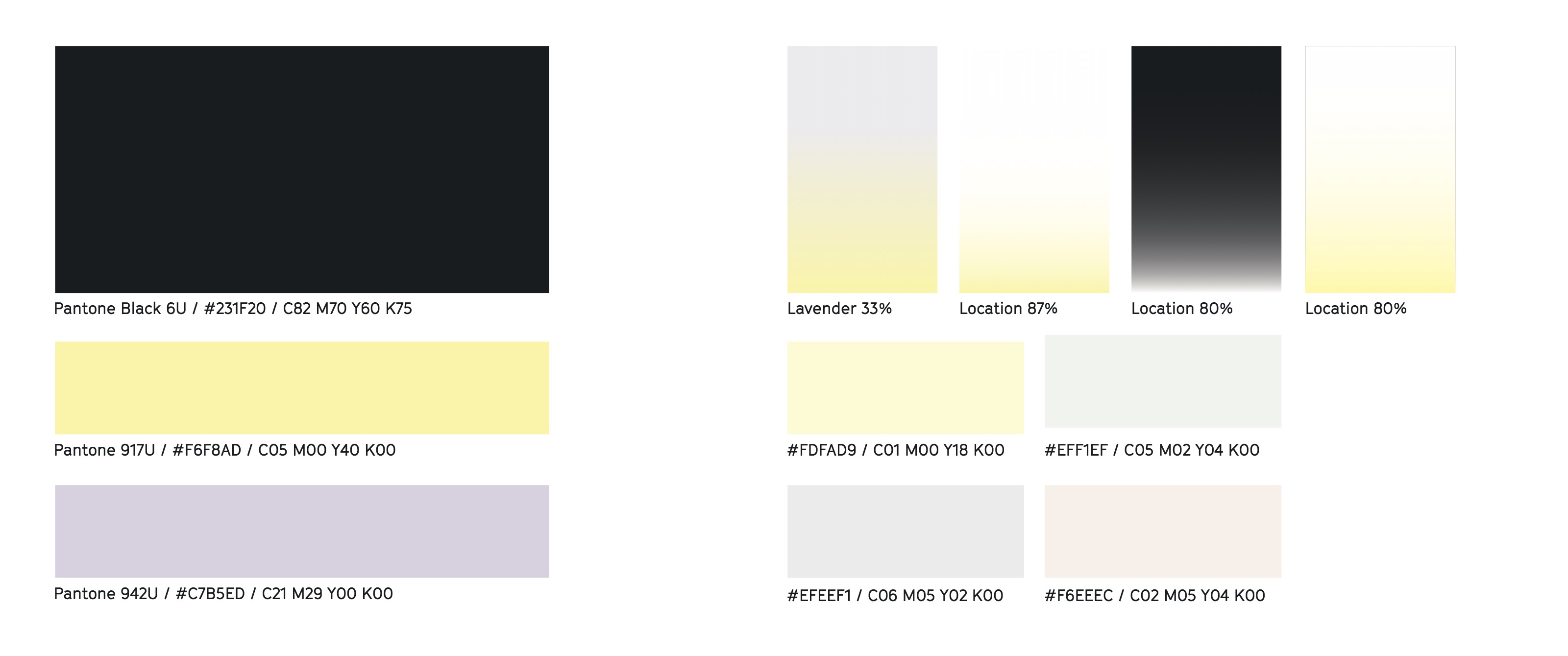
Images could be used in conjunction with the gradients, opening up to deeper colors for IDEAS and brighter colors for special events and the RUMBLE end-of-year guide.

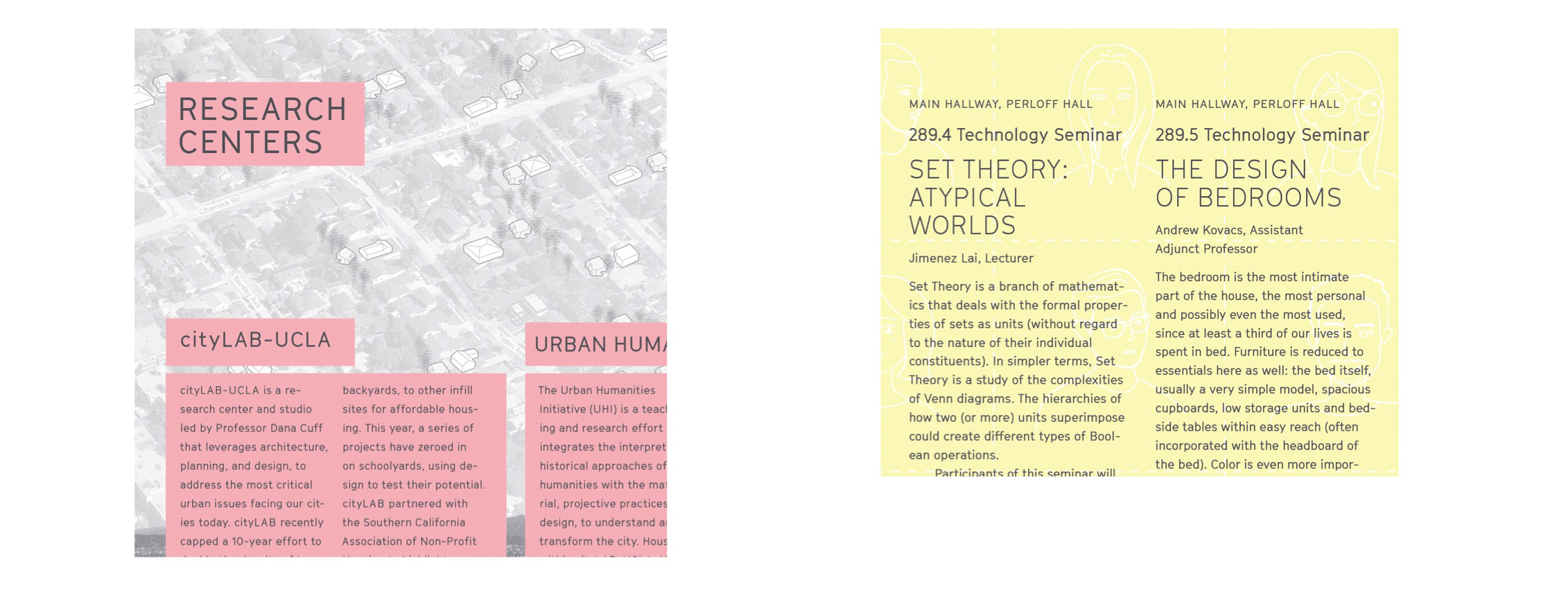

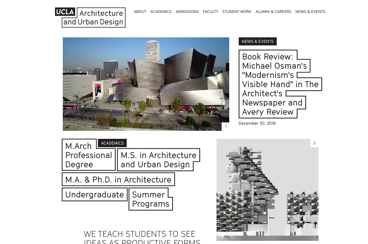
This flexibility was anchored by the box system, which was constructed within a grid. I was interested in making this in part because I don’t normally use grids when doing layouts: I just have a set of relational rules, and usually hang type and images from an invisible top line. Architects (and I was one) are notorious for trying to push stuff into a grid. I thought it would be interesting to play on that theme for an architecture school, this wish for everything to somehow come together in a grid, even when everything is all over the place.
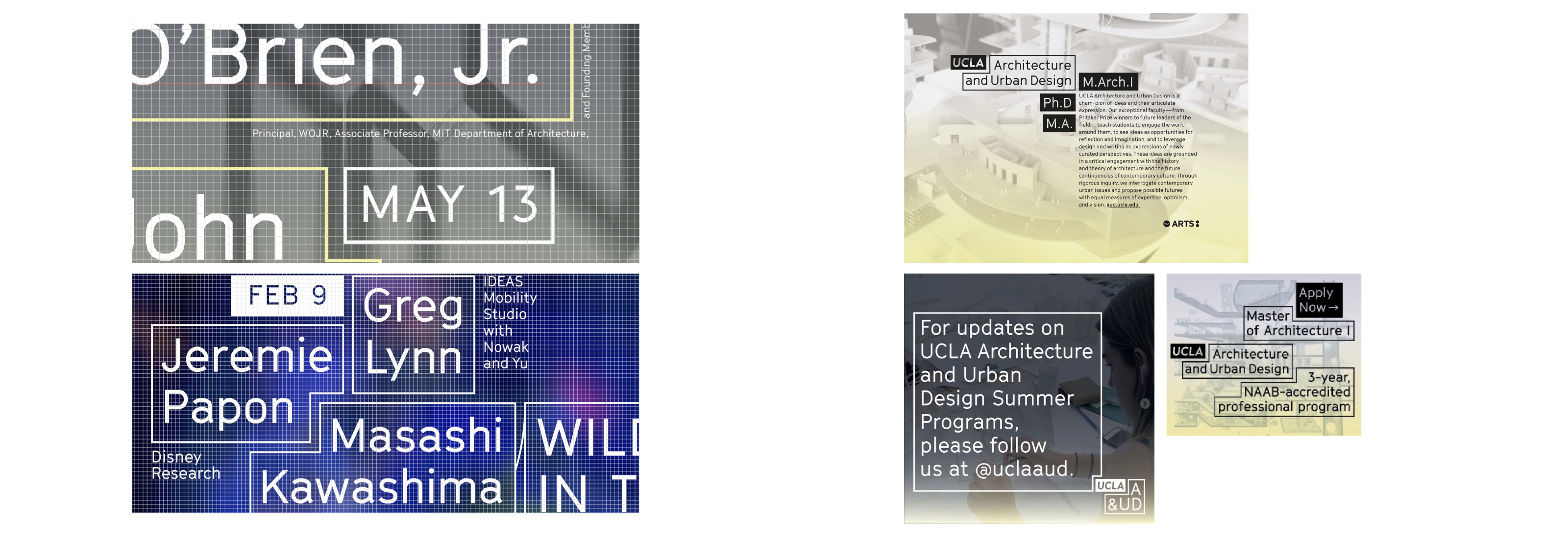


A fixed grid also presents major obstacles online, where each surface is a grid, but often a different grid with different rules. My colleague and friend E Roon Kang translated this beautifully for the web.

In the first two years, most of the identity was rendered in print, with just a few elements reserved for social media.
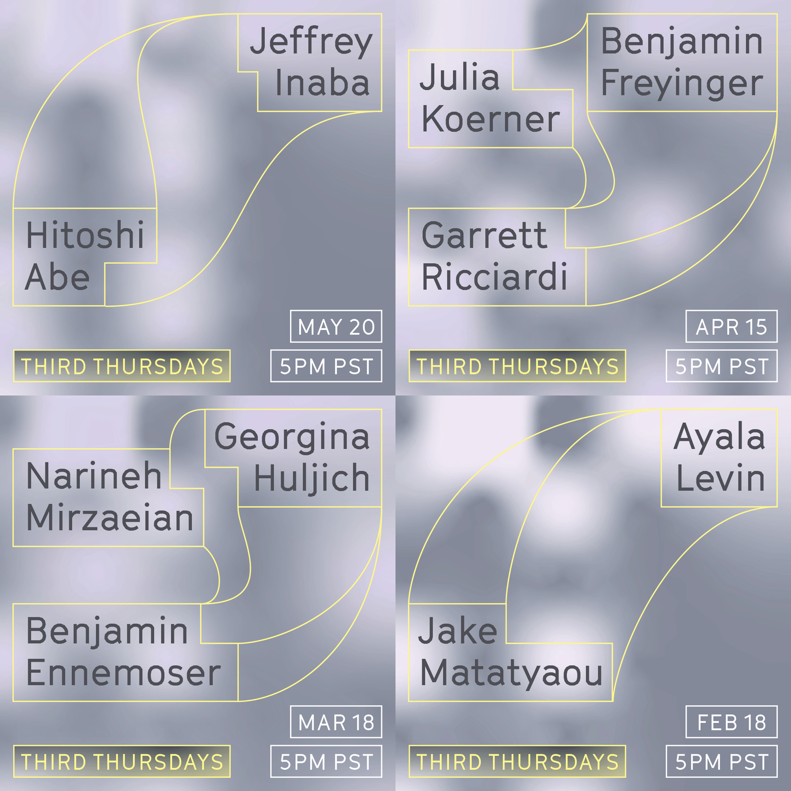
After Covid took hold in March 2020, most of the communication moved to social media, which meant embracing an element of motion, and thinking creatively about how to advertise public programs on the web. After a few rounds of making assets, it became repetitive, and I decided it was time to step away and let another designer give form to this new era. I look forward to seeing what will come next.
