Designing:
Identity and Branding:
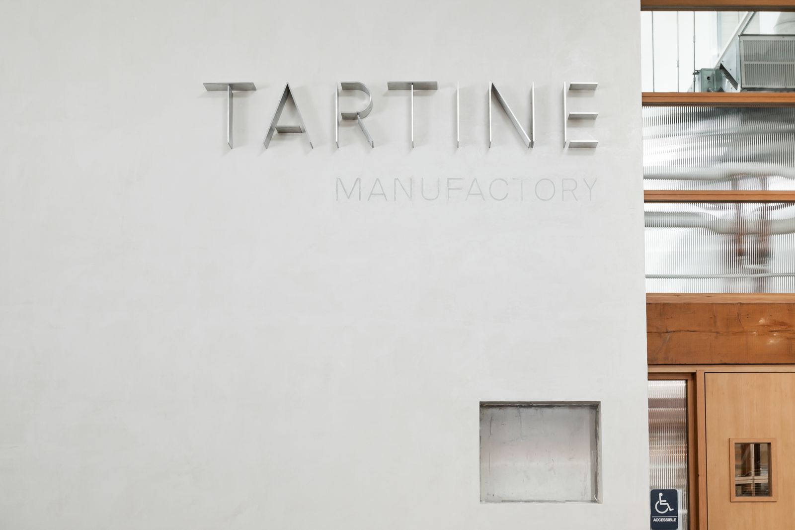
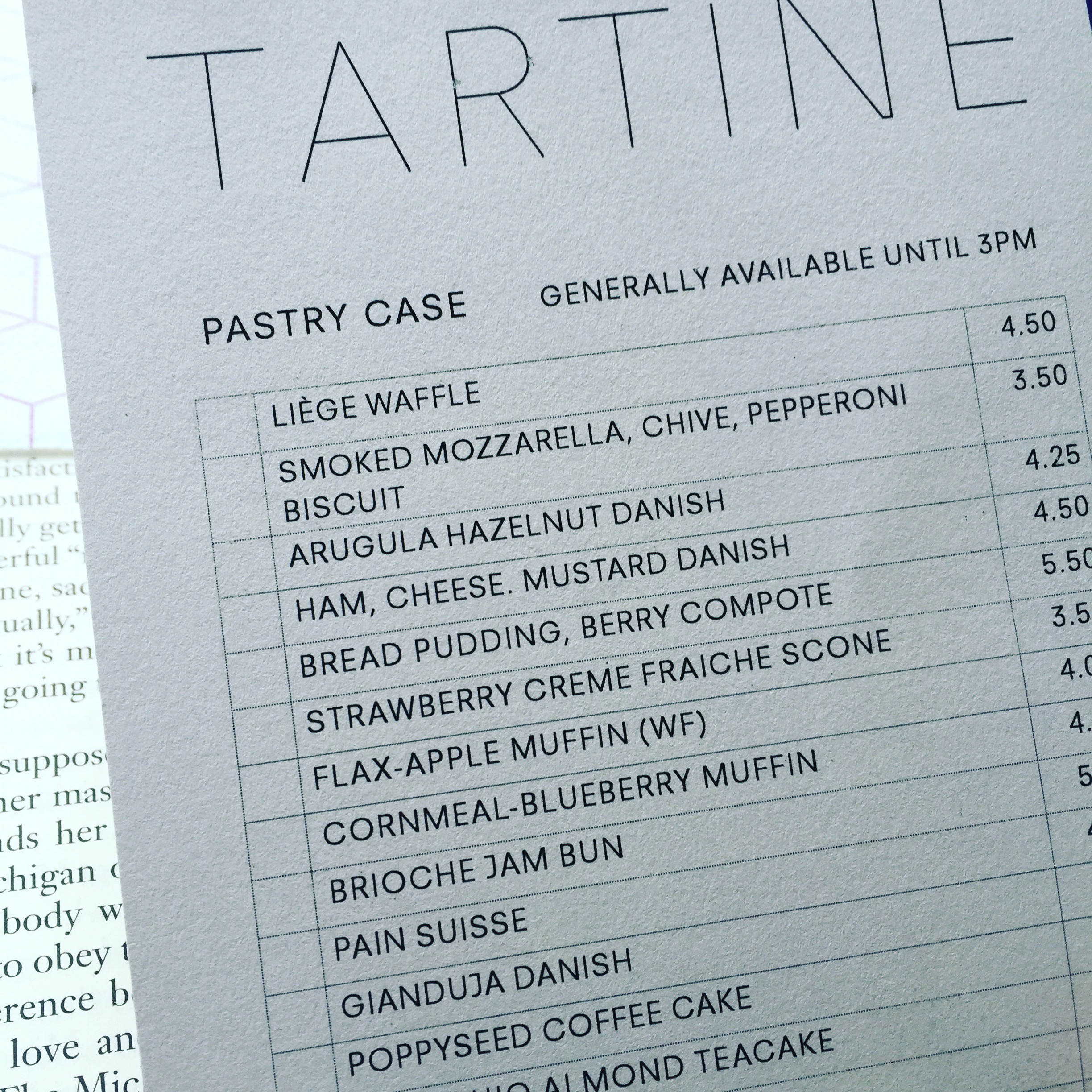
Tartine Manufactory
In 2016, Tartine Bakery expanded into a second space in San Francisco with many ideas for what it would become. They approached me to create a flexible identity that would work for the new space and everything that would or could be happening within it.
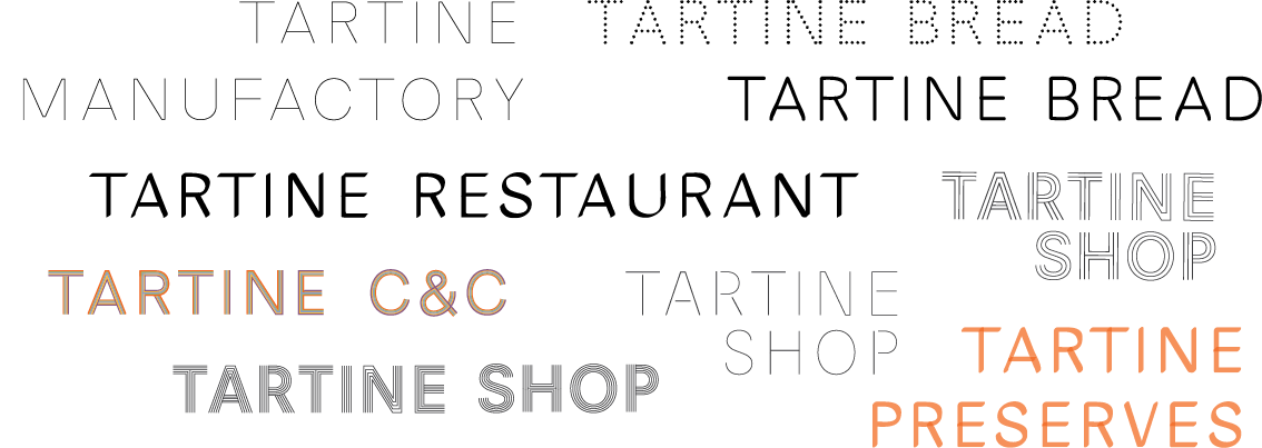
Working from the research I had done on the bakery and its culture when working on the design of Tartine Book No. 3, I developed a flexible system of type and principles that could drive the design of everything from signage to packaging without being tied to a single mark. The idea was to be “designed but not branded,” with a plan to be intentional about materials throughout, just as the bakery was in the making of its bread and pastries.
Working from the research I had done on the bakery and its culture when working on the design of Tartine Book No. 3, I developed a flexible system of type and principles that could drive the design of everything from signage to packaging without being tied to a single mark. The idea was to be “designed but not branded,” with a plan to be intentional about materials throughout, just as the bakery was in the making of its bread and pastries.
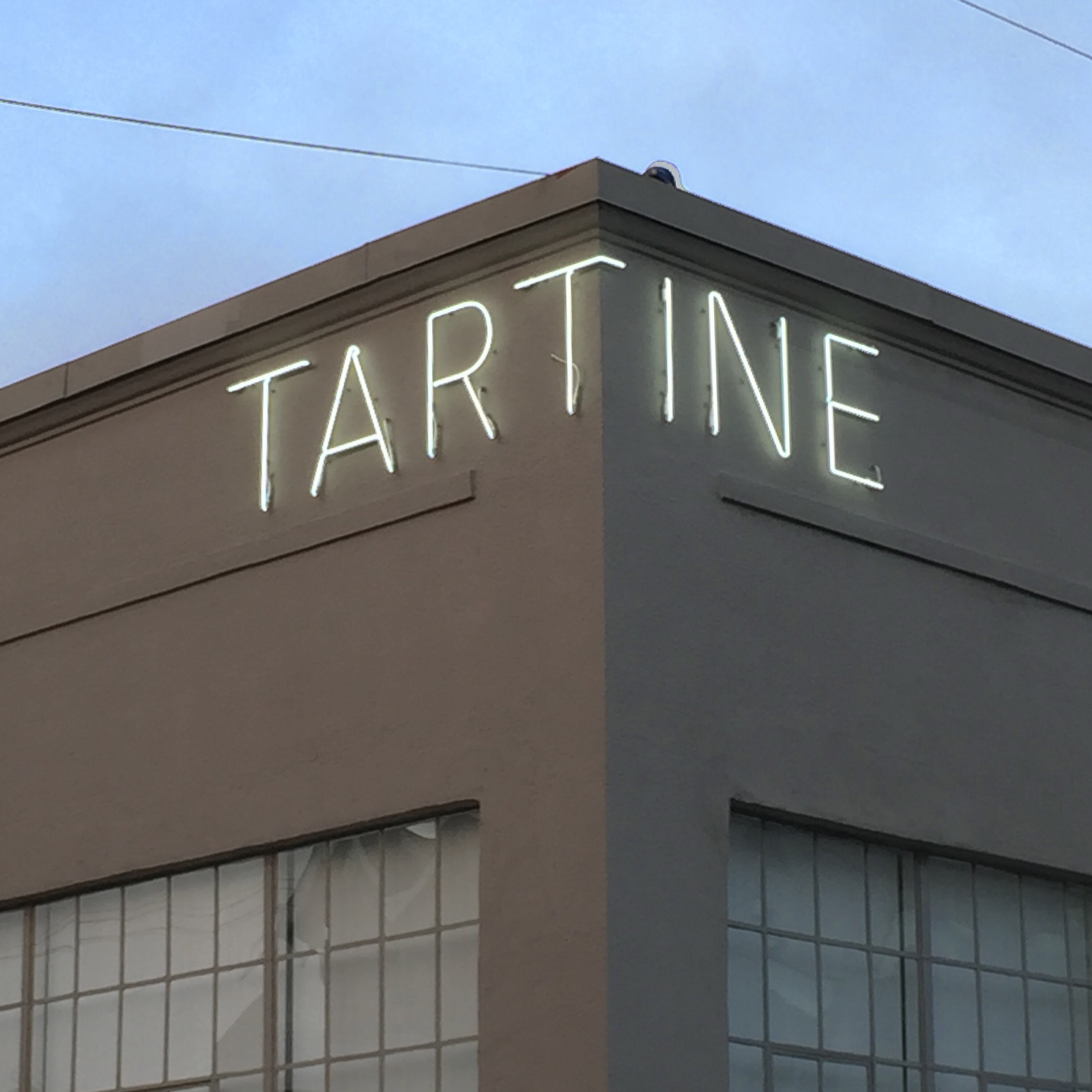

Manufactory sign
The primary driver was the neon sign, which would be rendered in a single line. Other items also followed that line in different ways, and with different materials. In an interior lobby, shared with Heath Ceramics, the material was steel, extruded out from the wall. Ice Cream was also a single line, without words, just ice cream.

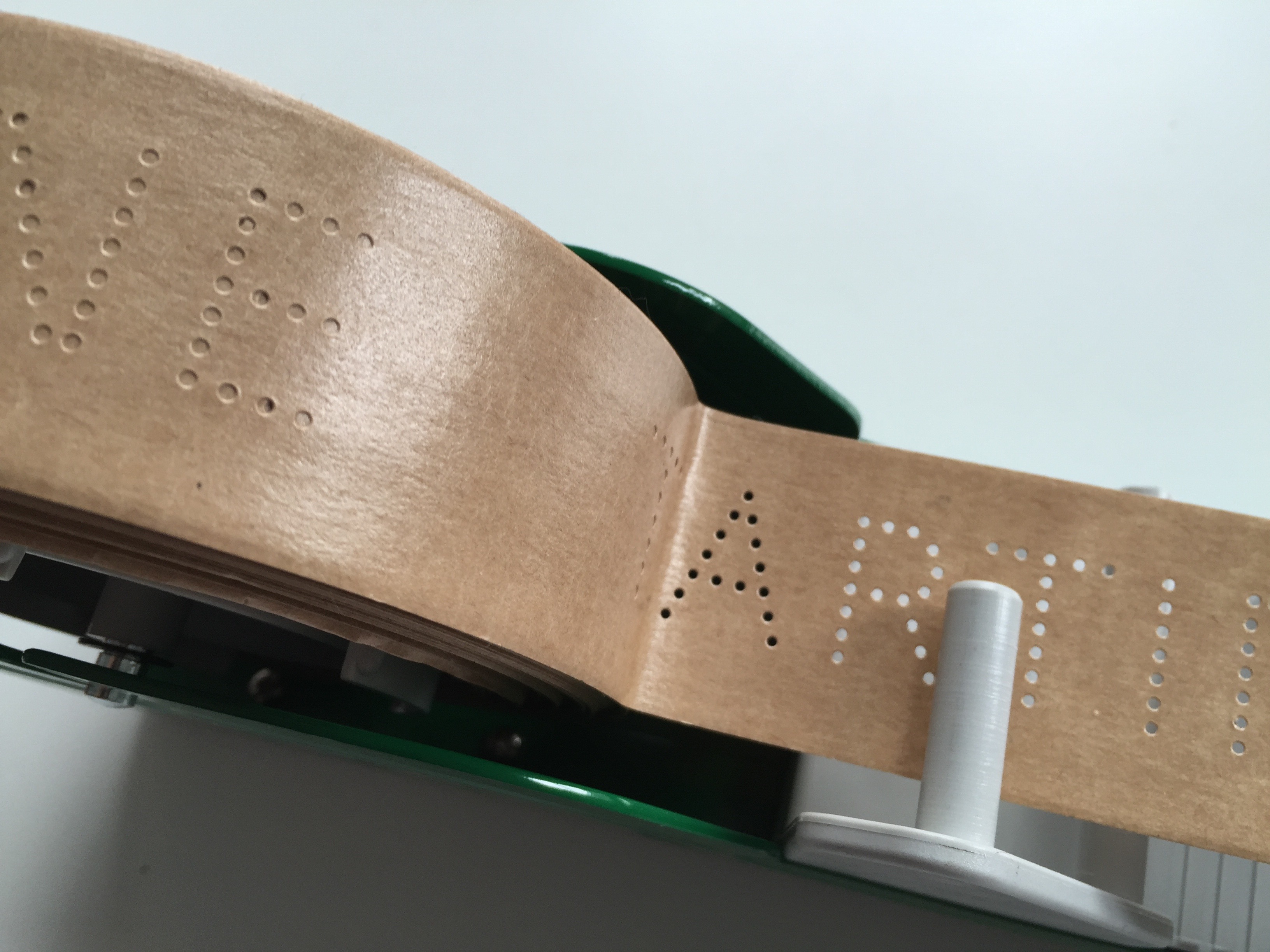
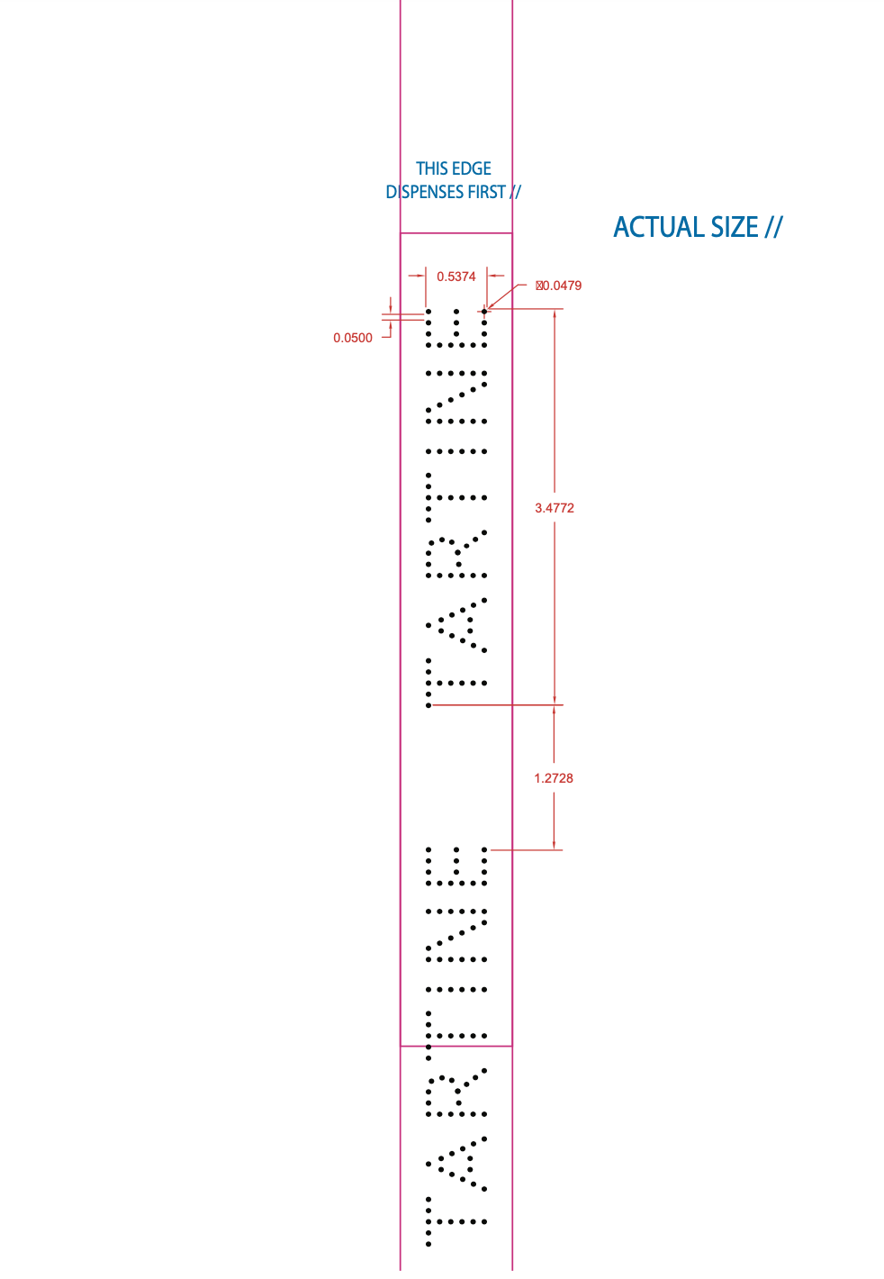
It was my dream, too, to make perforated tape. This, along with metallic stickers, served to label many items within the bakery.

Items that were printed were initially meant to be printed on a laser printer, but soon extended to foil on brown paper.


After the Manufactory opened, Tartine began a plan for expansion to many cities, and even the San Francisco airport. Business people were hired. At that scale, it made more sense to give up on this idea of design without branding, and I recommended that they hire a branding agency, so that they could grow.